
Design for websites has come a very long way since those heady days in the early 1990s when we watched with fascination as names like Yahoo, Amazon and Alta Vista first appeared on the clunky screens we were using back then.
There is no question that what we now call 'digital design' - designing for websites, apps, digital ads, etc - is an increasingly fine balance of art and science. Everybody wants the digital world to be beautiful to their own eyes, and that is, of course, a subjective judgment. But the clients of a digital agency like Webreality also need their digital assets to be cost-efficient to buy, cost-efficient to run, and to provide their customers with an easy and efficient experience resulting in optimal conversion rates. This is where the science bit comes in.
Over the almost three decades of the history of the commercial web, there has arguably only been one fundamental inflection point in design methodology: the need to adapt to the explosion in the use of mobile devices. You’ll probably have heard of 'responsive' or 'adaptive' design. This is design science in action - the use of code to ensure that a website’s user experience is always optimised for whatever device the user chooses to view it with.
But in the background, the digital design industry has continuously sought process improvements in delivering on those three big commercial requirements:
- cost-efficient to buy,
- cost-efficient to run, and
- easy user experience leading to maximum conversions.
In this blog post we outline Webreality’s answer to this evolving challenge.
Design systems
The foundation of our approach is to develop thoughtful ‘design systems’ for websites, apps and other products.
Put simply, a design system is a library of text and graphic components governed by a set of rules. Design systems are used in many industries, from engineering to fashion, because they promote consistency and scalability. The design system methodology we use is specific to digital products and is called ‘Atomic Design’.
What is Atomic Design?
Fundamentally, Atomic Design is about breaking down a website or app into its constituent parts. Rather than designing a finite set of inflexible webpages, we design a library of components that can be combined in countless ways to build a huge variety of webpages.
By organising the individual components within a hierarchy governed by specific rules, we can use them to design and build websites that are flexible and perform better across a greater range of devices than ever before.
Why do we design ‘atomically’?
We’ve found that by creating atomic design systems, we achieve greater consistency and cohesion across the entire user experience. During the design phase, there is greater emphasis on how the user will interact with a website, not just how it looks. This results in a better user experience and, ultimately, better conversion rates.
During website projects, the design system serves as a central hub for a more collaborative workflow between all members of the project team, and drastically reduces the time spent on performance and usability testing.
And once a website or app is live, with a design system in place, we can make future iterations and changes more swiftly, saving time and money. The design system provides a future-friendly foundation for teams to modify, extend and improve over time.
Atomic Design in practice
The Atomic design approach consists of three ‘levels’: Atoms, Molecules and Organisms.
Atoms
Atoms are the simplest elements - things like typography, colour palette, buttons, module styles, icons, etc. These elements can be combined together in many ways to create more complex Molecules.
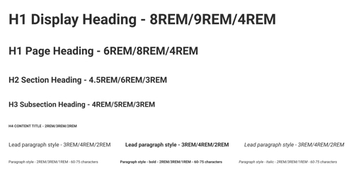
This is an example of typography at the atomic level. We define size, weight, line height and spacing for each type style. We create different ‘rules’ for Desktop, Tablet and Mobile to ensure the type looks its best no matter which device is used.
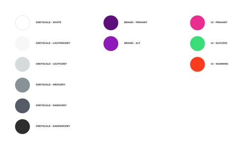
We also create a sitewide colour palette and introduce rules for its usage. For example, a high contrast colour might be used for buttons, whilst a tonal variation of a core brand colour might be used for page titles. By ensuring we create rules for every element, we’ll be able to create a consistent and user-friendly site.
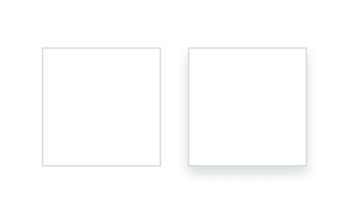
Atoms can also be used to distinguish various states, such as hover effects and animations. This type of visual feedback helps to guide users through a website. In the above example, you can see how a module on a webpage might change in appearance when a mouse cursor ‘hovers’ over it. This animation and effect could then be applied to any component from the design system library.
Molecules
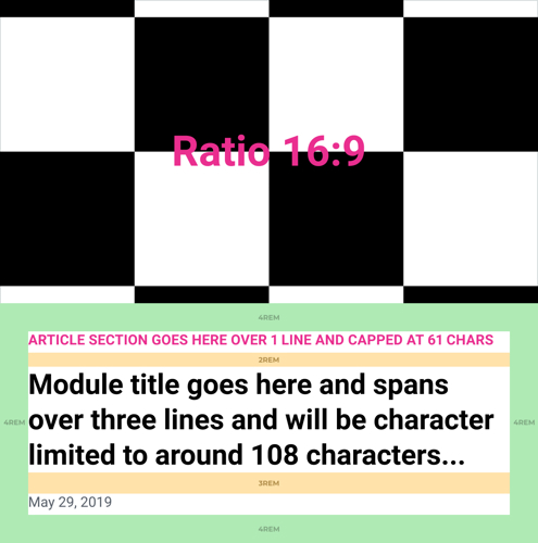
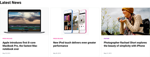
Once we have defined and created our atoms, it’s time to start using them to build elements of a website. For this example we’ll be creating a module promoting a news article.
Rather than the bespoke spacing for different elements and pages, we apply rules to govern consistent spacing across our websites. And rather than setting absolute rules for spacing, we use a proportional, relative scale based on units called REMs. It means the designers and developers can use the same language to create highly responsive designs without having to work to a specific number of pixels. Typically we set up our systems so that 1REM is roughly equivalent to 8px, 2REM is 16px and so on.
We then create modules based on the rules we established at the atomic level, so that our designs can flexibly support a wide range of content. We design our modules to fit ‘worst case scenario’ content, so sites don’t break from unforeseen text or image uploads.
After we create molecules, we move onto creating organisms.
Organisms
An organism is a collection of molecules. These are the final building blocks of the site that the user will see and interact with.
We take our completed molecule element and apply real world content. We then decide how we want these to be displayed on desktop, tablet and mobile views. For example, you may have three columns on desktop, two on tablet and a single column on mobile.

As you can see below, we have a desktop organism composed of a heading and three molecules.
The layout, spacing and behaviour of these molecules, and all the elements that combine to make them, is still controlled by the system we set up at the ‘atomic’ level. This means that if we need to change the size of the title, for example, we only have to change the rule once, not adjust multiple bits of text. The result is an accurate, flexible template that will work across a range of devices and look great no matter where someone views your website.
What’s in it for you?
By working in this way, we aim to get products to market faster, with a better chance of commercial success in terms of measurable conversions, and with ease of future changes and developments baked in. And the beauty? That will always be in the eye of the beholder, but we hope that you’ll see plenty to love in our work.
We adopt a collaborative approach to designing solutions for our clients, getting them actively involved in the design process wherever possible. It creates a shared sense of involvement, ownership and pride in the outcome. We’re happy that our clients get to enjoy the design process with us, and also that they benefit from the very latest digital design methodology.
Interested in seeing what a design system can do for your business? Contact us today to find out more.
Images courtesy of Apple.com